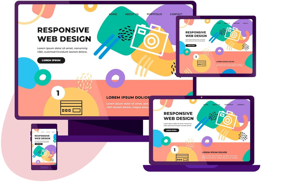
Responsive Website Design Services
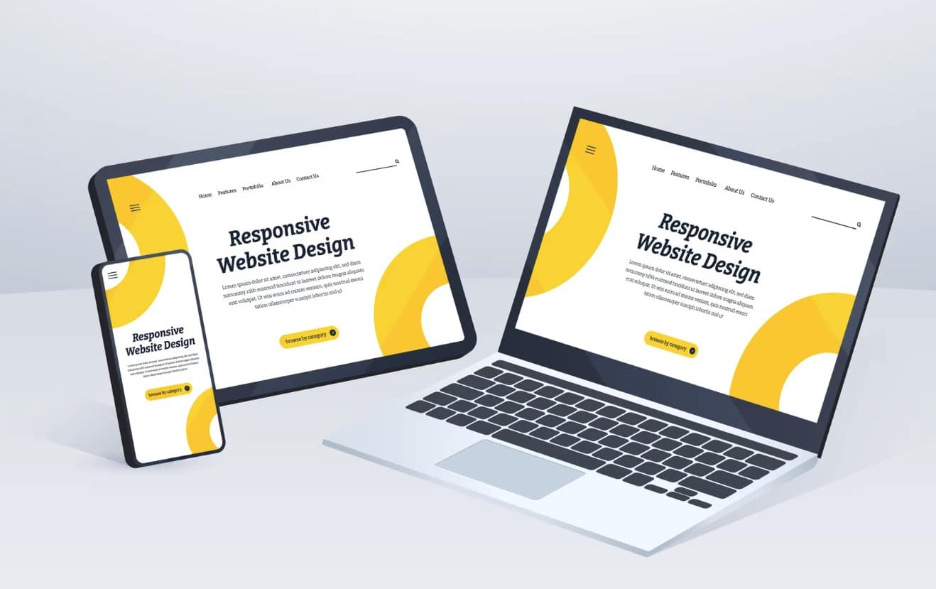
Mobile-Friendly Websites That Adapt to Every Device
At arulmjoseph.com, we design responsive websites that automatically adjust to any screen size—mobile, tablet, laptop, or desktop. A responsive website improves user experience, boosts SEO rankings, and reduces bounce rates.
Whether you need a Shopify store, WooCommerce shop, corporate website, or personal portfolio, our responsive design ensures fast, mobile-optimized, and conversion-focused performance.
Why Responsive Design Matters
-
Boosts Mobile SEO: Google prioritizes mobile-friendly websites.
-
Faster Load Times: Optimized assets improve performance on all devices.
-
Improved UX: Eliminate pinch-zoom frustrations and enhance readability.
-
Cost-Effective: One design, multiple devices—no need for separate mobile sites.
-
Higher Conversions: Consistent user journeys improve sales and lead generation
Features of Our Responsive Website Design
-
Mobile-first UI/UX design
-
Retina-ready layouts for high-resolution displays
-
Performance-optimized media scaling
-
Flexible grids & media queries (HTML5 + CSS3)
-
SEO-friendly structure & clean code

Who Is It For?
-
Businesses needing a mobile-ready online presence
-
Shopify or WooCommerce store owners
-
Freelancers and personal brands
-
Corporates upgrading from legacy static websites
-
Agencies looking to outsource white-label design
Industries We Serve
-
E-commerce
-
Healthcare & Clinics
-
Travel & Hospitality
-
Education
-
Professional Services
Add-On Services Available
-
AMP integration for faster mobile loading
-
Progressive Web App (PWA) integration
-
Custom responsive landing pages
-
Speed optimization using tools like Core Web Vitals
-
Shopify mobile optimization packages
Frequently Asked Questions (FAQ)

Responsive web design ensures your website automatically adjusts to fit any screen size, giving users the best experience on mobile, tablet, or desktop.
Yes ✅. Google prioritizes mobile-friendly websites, so responsive design directly improves your search engine rankings.
Absolutely. We can upgrade your current website with a mobile-first responsive design without losing existing content.
Yes. A responsive website works in any browser, while a mobile app must be downloaded. Responsive design is more cost-effective for businesses.
Yes, we specialize in Shopify and WooCommerce responsive design, ensuring your eCommerce store looks perfect on all devices.